How to Use a Color Wheel for Web Design
Best Ways to Use the Color Wheel for Website Design
Color is an extremely important factor in design, particularly, in website design. Not only for professional designers, but amateur users should also have the basic knowledge about applying colors to a website. That can help create an appropriate and impressive look for their site. And one of the basic skills when choosing colors is using the color wheel. So in this article, I will analyze and guide you on the basic and most important factors in applying the color wheel to website design.
What is the Color Wheel And Why Should You Use It?
What is the color wheel?
The color wheel is a circle containing all the basic colors. Look at it, we can learn the relationship between them. It's known as the fundamental theory to choose colors for every aspect of life. For example, choosing color for clothes, furniture, art, …
Particularly, applying the color wheel is important not only for professional designers but also for those who want to own a beautiful website. A website contains different elements and they absolutely have more than only one color, so you surely need to combine them. Therefore, using the color wheel will ensure the harmony of all the colors and highlight the desirable, making your website gorgeous and prominent.
Benefits of the Color Wheel in Website Design
The color wheel will help you answer the question such as how to attract readers and customers? How to keep them staying longer on your website? Or How to make your website stand out from the competitors?
Create an Effective Branding Strategy
Branding and highlighting your website is so important. It is essential to use colors for your logos, text, headlines, images on the page, etc., in a harmonious, beautiful, and also unique way.
If you can master the color wheel and use it effectively and reasonably, you can considerably gain your customers' and readers' impression on your website. Even when they come across any colors that look like your website's color, they will immediately think about you.
In addition, based on the color wheel, you can create many different color sets, or even create a new trend for your website. Hence, your website can become distinctive and novel for your own brand. However, if you're too creative, your website may not be as effective as it should be because there are still general rules that you need to pay attention to. Therefore, you should follow the theory of the color wheel.
Attract People by the Website with Beautiful Color
You should know people are very sensitive and aware of your website's appearance. A well-designed website with good use of color will keep their attention so they will stay longer, read more, then perhaps, decide to buy your products. It's like when your house has guests. Do you want them to give a compliment on your beautiful house or feel so uncomfortable with unattractive colors? Especially with the reading website like a blog, you absolutely need to use color for texts and background to avoid eye strain while reading.
The Terminology of the Color Wheel
The Main Color Models
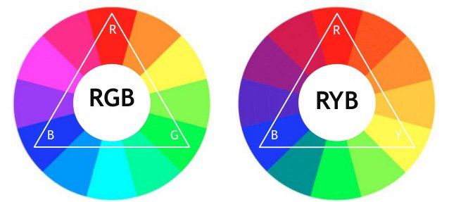
The RGB model stands for Red, Green, and Blue. It is the main color model in website design because it can reduce the ultraviolet ray from the electrical devices.
Additionally, there are other models like RYB (stands for Red, yellow, and Blue) usually used in painting and art; or CMY model often used in printing.
The Combination of Colors
The color wheel itself is the mixing of colors. These colors will be divided into different levels. Starting from an unmixed color called Primary Color (in RGB, primary colors are red, green, and blue), and then continue to mix Primary Colors together to have Secondary Colors, then mix Secondary Colors together to have Tertiary Colors.
Cool Color and Warm Color
Warm Colors are colors in the yellow, red, and orange side. They make you feel "hot" when looking at them. In contrast, Cool Colors bring about coldness. They are the colors in the green, blue, and purple side.
The Characteristics of Color
Colors have various characteristics, but in website design, we will pay more attention to the lightness and darkness of each color called Hue.
There are 3 kinds of Hue: Tint (created by adding lightness) makes things purer, Shade (created by adding darkness) makes things shady, and Tone (add both lightness and darkness to color) looks more natural and delicate.

After understanding the theory of the color wheel, you can easily know how to use it for designing your website or changing your theme's color. Here are the detailed instructions to select and combine colors for your website.
How to Apply the Color Wheel for Website Design
There are 4 major color schemes to use: the Monotone color scheme, the Complementary color scheme, the Analogous color scheme, the triangle model including the Triadic and Split-Complementary scheme, and the last one,Te tradic.
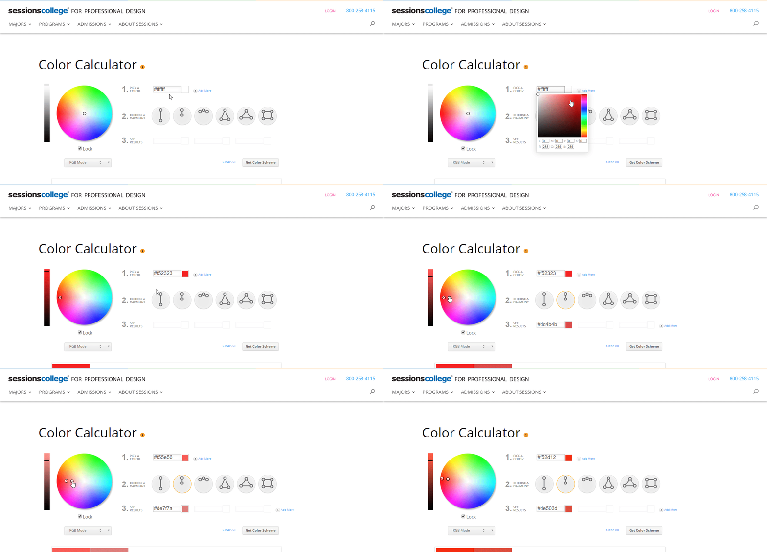
You can use a very useful tool called Color Calculator here to help you choose the color scheme easily. You just need to choose a primary color in the Pick a color section and choose the color scheme in the Choose a harmony part. The corresponding color in the chosen scheme will show up in the See results part.

Using Monotone Color Scheme on the Color Wheel
This color scheme lets you use one color with different tint, tone, and shade on the color wheel to make different lightness and darkness. As a result, it gives your website consistency and avoids distractions.
For instance, GretaThemes website uses blue as the primary color. But the buttons and important texts, headings are dark blue while the background color is light blue to make it readable.

In the Color Calculator, you can choose one primary color and then click the Monochromatic in Color harmony section. In the See a result section, you will see the corresponding Monotone color. Otherwise, you can drag the two-point on the the color wheel to find the two Monotone colors as I did here:
This is the simplest and most popular color scheme. Notably, it fits with a website with typical color, for example, a wedding website often has pink, violet, or red as the main tone; or a website about nature should be green. From these primary colors, you just need to mix the lightness and darkness to create different tint, tone, and shade.
Using Complementary Color Scheme on the Color Wheel
On the color wheel, draw a line through the center of the circle to find two complementary colors.
These colors can make your website outstanding and prominent so you should make use of it to create emphasis and a strong impression. For example, you should highlight buttons by putting them on a complementary color background to encourage people to click it. However, you should be careful as they may be too "jarring". So you shouldn't use them with the 1:1 ratio. One color should be used less than another.
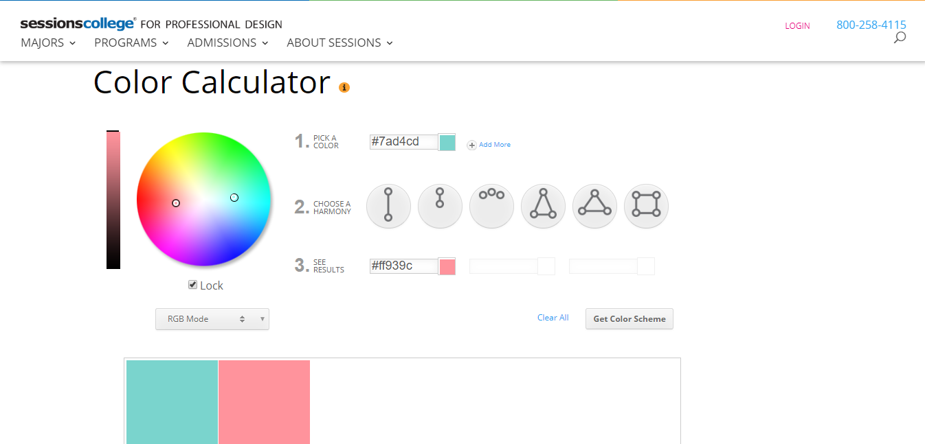
In the Color Calculator, choose the Complementary section to find the two complementary colors.

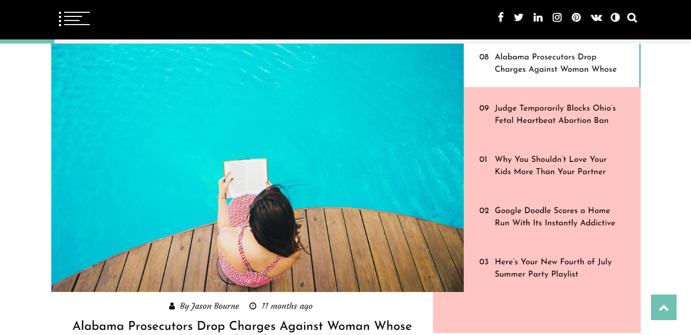
Like mint blue and coral pink are the complementary colors:
When used reasonably, they look great:
Using Analogous Color Scheme on the Color Wheel
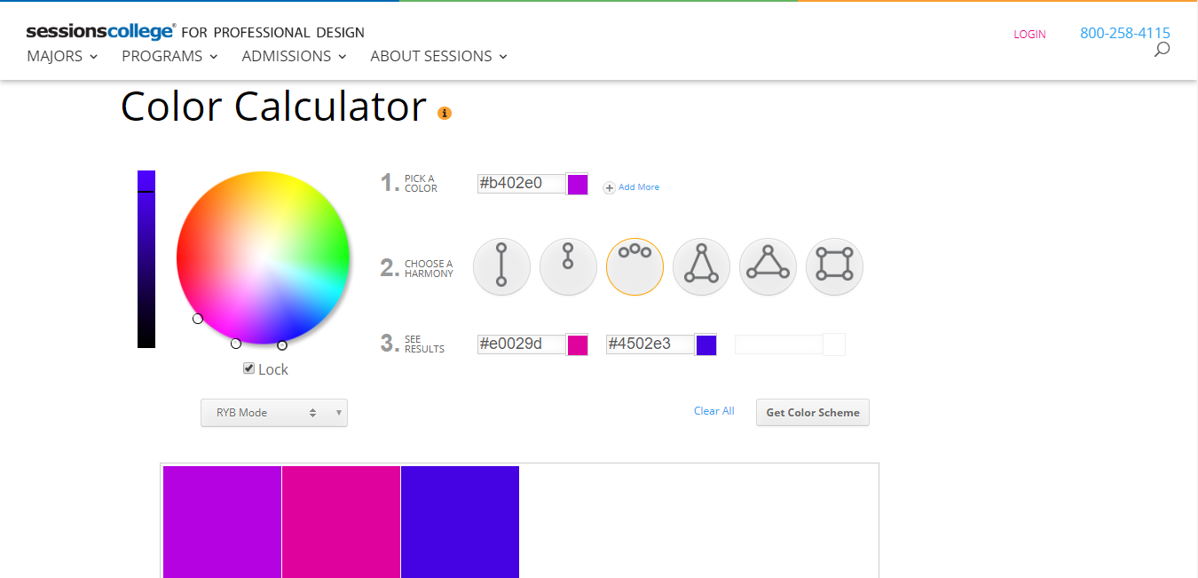
Analogous colors are three colors standing next to each other on the color wheel so they bring about diversity and harmony at the same time. However, like the Complementary color scheme, you shouldn't use the 1:1 mixing ratio.
Select Analogous in the Color Calculator and you will find the three Analogous colors. For example, the powerful three colors pink-violet-blue used to be a hot trend.
Their application:

Using the Triadic and Split Complementary Color Scheme on the Color Wheel
The two models are made of three color-points which create an equilateral triangle or isosceles triangle on the color wheel. These colors also highly contrast to each other, but less than the complimentary color. Thus, your website looks both colorful and harmonious with them.
You can choose the equilateral triangle symbol (Triadic colors) or isosceles triangle one (Split Complementary color) in Color Calculator. Yet note that the Triadic colors have greater contrast than Split Complementary color, so you should use it to make emphasis for some important elements in your website.
For example, let compare the green-red-blue Triadic color with the green-pink-blue Split Complementary color. They all have blue and green, but red has more tension than pink so the Triadic color is more vibrant.
[caption id="" align="aligncenter" width="1348"]
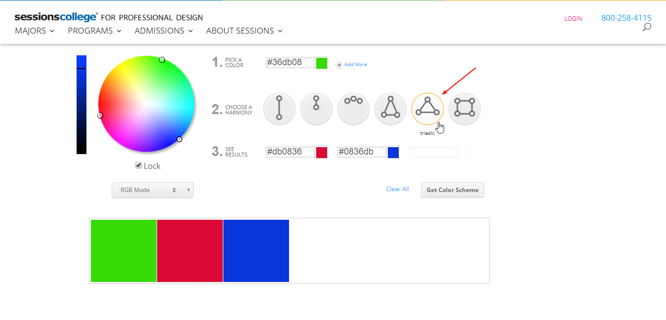
Triadic color scheme[/caption][caption id="" align="aligncenter" width="1349"]

Split Complementary color scheme[/caption]
Using the Tetradic Color Scheme in Color Wheel
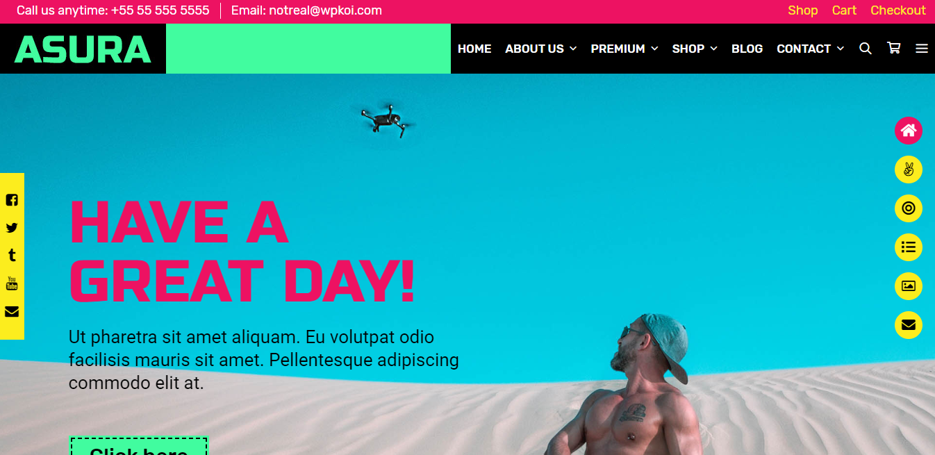
Finally, we have a set of four colors consisting of four equally spaced color-points. They form a quadrilateral on the color wheel. This is probably the most difficult way to use because if you're not careful, your website will become tangled and lose its balance.

If you want to create web based on color blocks, use them wisely to make your site so colorful, dynamic, and youthful like the example below:
Final Thought
After this 10-minute-reading article, you can gain all the color wheel theory and how to apply the color wheel to the website design. Hopefully, we help you make it easier to design and combine color when creating a website, or customize a WordPress theme to get the best look and color for your website.
— — —
The official publication at GretaThemes.
How to Use a Color Wheel for Web Design
Source: https://medium.com/gretathemes/best-ways-to-use-the-color-wheel-for-website-design-f476ca2705ad#:~:text=Using%20Complementary%20Color%20Scheme%20on,emphasis%20and%20a%20strong%20impression.
0 Response to "How to Use a Color Wheel for Web Design"
Post a Comment