How Is Space Used to Set Mood in Design
The essence of space in design
Understanding why space is an essential building block of great UI layout design its differences and best practices for using it.
![]()
What is Space?
 S pace is the dimension of height, depth and width within which all things exist and move. Space or Empty space or White space or Negative space are alias given to describe intensional spaces made in design. In a digital world, we live in limited dimension of screen. People tend to fill up empty spaces to get maximum benefit out of it but rather know the importance and beauty of it.
Negative space creates a vacuu m of content, which draws more importance and adheres attention to the existing content. Not only these they helps in readability, provide feedback and increase usability. These spaces creates room to breath and users feel comfortable looking or exploring it.
"Good visual hierarchy isn't about wild and crazy graphics or the newest Photoshop filters, it's about organizing information in a way that's usable, accessible, and logical to the everyday site visitor."
Brandon Jones — Former Editor of Tuts+
Space takes its major role in other field of design as well like Architecture. Architects have their in-depth analysis of spaces which is widely called Space Planning. Its a in-depth analysis of how floor space is used without wasting space. But in context of digital spaces we just focus on how we do our layouts right.
In Graphic design, we generally see the term Negative space used. The graphical element used in graphics with any hidden shapes or identity inside design which can completely change the aesthetic of the element designed.
If everything yells for your viewer's attention , nothing is heard.
- Aarron Walter "Design for Emotion"
Types of Space
The types of spaces in digital world can be classified by functionality and size. According to functionality it can be active or passive and according to size it can be micro and macro white space as well.
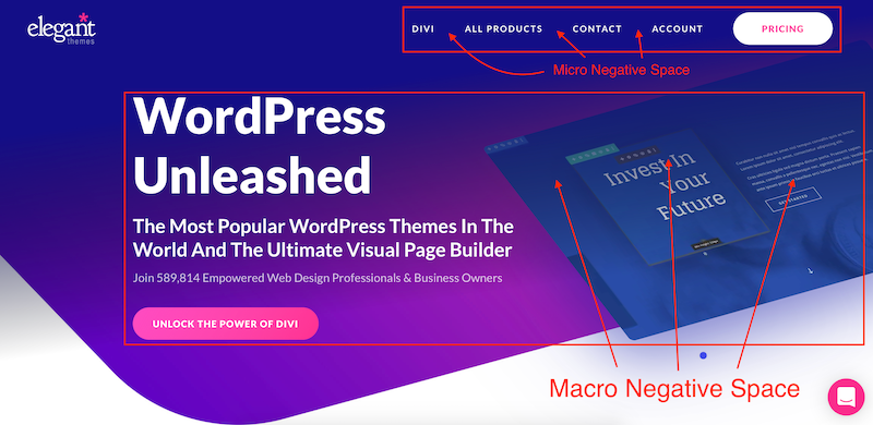
Micro Space:
It is the space between the small elements like letters, lines, icons, forms, paragraph, buttons and graphical element. Adding micro space whenever our design needs a little more breathing room but you don't have enough canvas left to work with. Tweaking the amount of space between our smallest elements will help us to express clearly and become noticeable which ultimately improve our design and look rather less over cluttered.
Macro Space:
It is the term given to larger volumes of white space. The space between bigger elements like text columns and graphics. It also refers to paddings and margins. These areas have a greater impact on the user's journey through our product and macro space is often pretty accurately planned. It separates and groups elements giving visual clues of functionality and uplifts readability.
Active White Space:
This is the space that you make a conscious effort to add to your design for emphasis and structure. Active white space is often asymmetrical, which makes the design look more dynamic and active. It draws a user's attention and to emphasize certain elements like a headline, logo or graphic inside our design.
Passive White Space:
The space between small objects that goes unnoticed. The designers use it to create texts or arrange paragraphs or icons. It generally occurs naturally, such as the area between words on a line or the space surrounding a logo or graphic element. Though it goes without being noticed, this white space is intentionally added there in a very subtle way, to allow the eye to easily read the design/text.
Importance of Space
Designers love it, website owners want to fill it. Whitespace seems to be one of the most controversial aspects of design.
— Paul Boag
The importance of space are countless. The problem I mostly face during times is lack of realisation among business stakeholders is they want to squeeze more into the screen as mentioned in the quote.
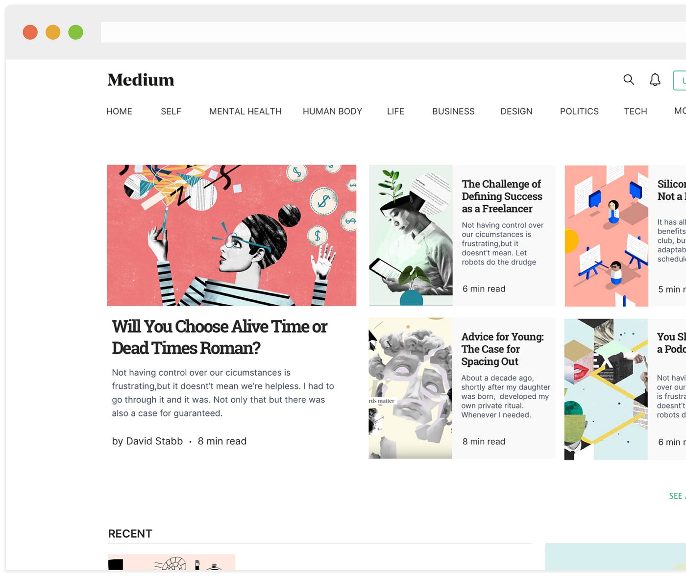
- Separation and Grouping of elements can be clearly seen and users can easily distinguish and differentiate between elements based on proximity.
- Adds luxury and sophistication to the element as a whole. White space can actually become a central element in a design when it's used to create a certain mood or look.
- Adding emphasis to the design can be really helpful with space. The negative space is giving you visual clues about where you should be looking, providing plenty of buffer room around an element so that your brain can quickly process it.
- Spaces invokes imagination, when we see space in design, it allows us to imagine and roam free.
- It creates visual hierarchy to the elements when gaps are created to ensure that the users can find and digest information presented more easily.
- Enhancing the usability in a sense where users will be able to easily read and comprehend the content you want to serve them. They should not be intimidated by a large amount of text — when its spacing is not big enough, it will look difficult to comprehend and it will result in a higher rate of leaving the website or application. Whereas enough white space will prevent that happening.
- More spaces makes the experience of the user more lightweight, easy and comfortable to explore.
Noticeable Usage
The industry leaders and leading tech companies have been using this actively to get the advantages provided by the power of space. Let's see some of the example in real world.
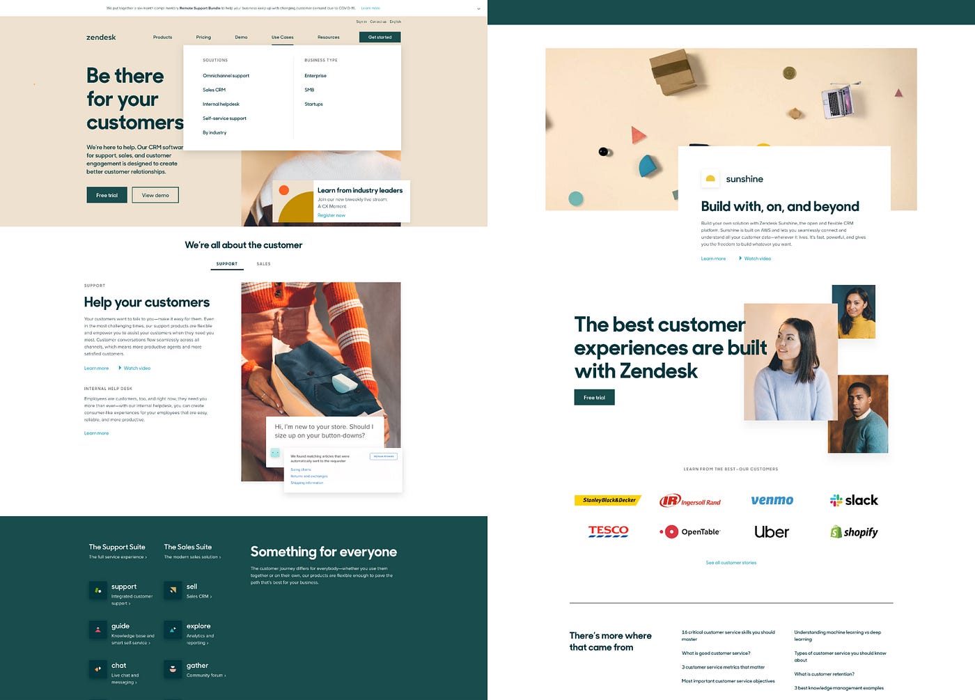
Zendesk has awesome use of white space into their design despite use of awesome color combination. We can see that our eyes flows into the design and it's obvious to see the text with high visual weight and spaces creates more attention to it.
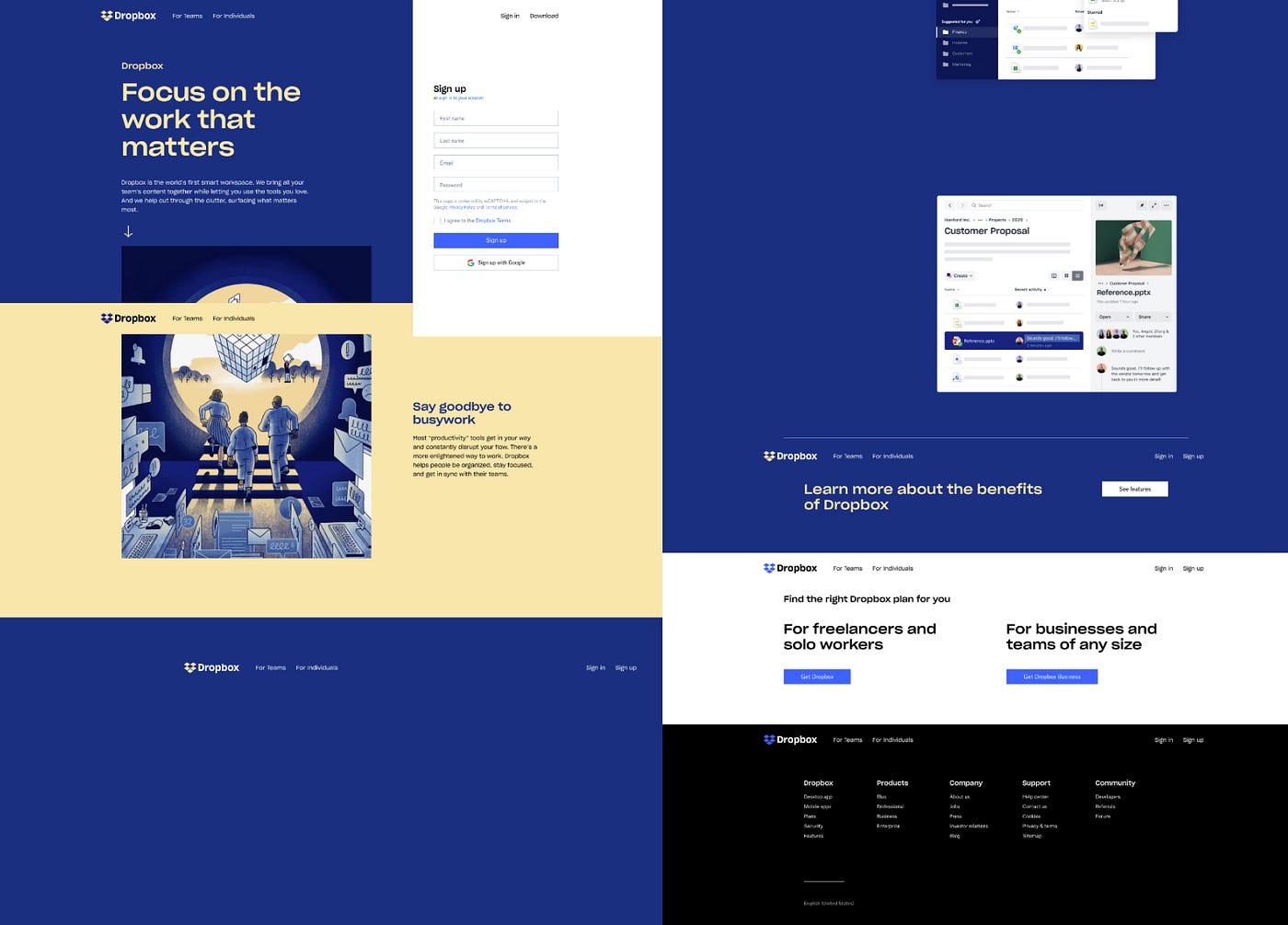
Dropbox have moved to a vast surprising rebrand. The colors and whitespaces used to make the content separate out from each other is awesome and well achieved. The separated blocks help keep the copy contained while still providing ample breathing room for the content, we'll see whitespace is also used on a micro-level through the line-height, font size, and kerning are all taken into consideration.

Apple are the early adopters of whitespace. The screen of apple would always have more focus to product and declutter the UI with empty spaces. Also one of the most noticeable thing they do is interactivity as well.
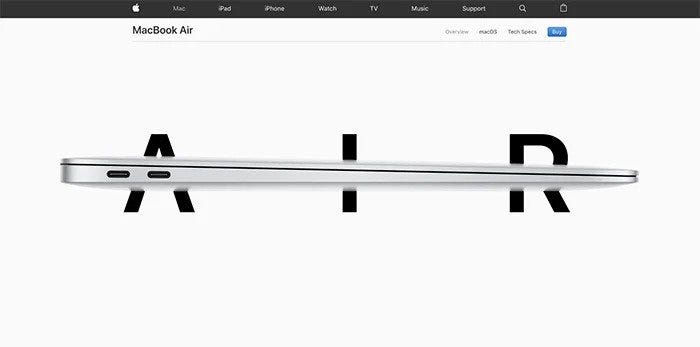
Not only does Apple execute active whitespace throughout the website well by placing imagery strategically to draw the users eye to specific elements down the page, but the company also uses passive whitespace to guide the user through the content without a hitch.
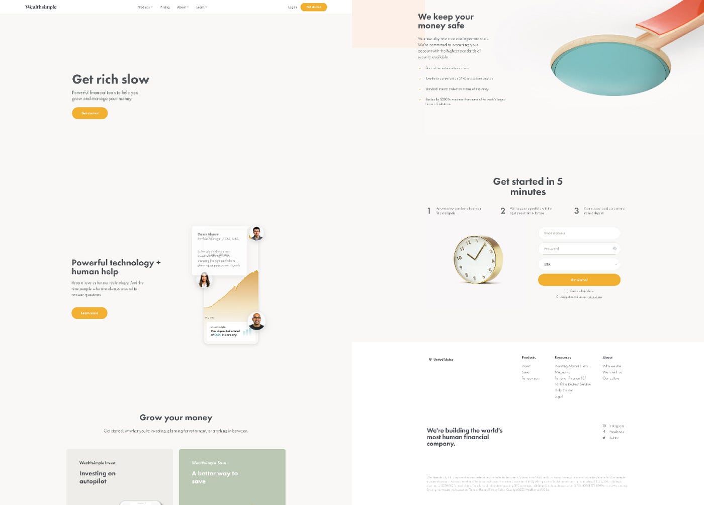
WealthSimple homepage is just to its notch. Its so simple and pleasure to navigate through the screens and also an excellent example of how to use whitespace as well. The angles used in images also provides generous whitespace. Users eyes are also drawn into the animation used and distinguished CTA sections.
How Is Space Used to Set Mood in Design
Source: https://uxdesign.cc/the-essence-of-space-in-design-b71f42166b82
0 Response to "How Is Space Used to Set Mood in Design"
Post a Comment